Want to get more conversions? Then you have to improve the landing page which helps you to get genuine buyers in real-time. These landing pages can either build up or they can break your business.
Similar to the concept of leaky buckets poor landing pages won’t make good conversions. So, you need to adjust the loopholes in optimizing your landing page to ensure higher conversion rates. It’s important to make a good investment in getting desired results.
Here, a few things are discussed, that you need to know for a higher conversion via the PPC campaign.
Landing Page or Microsite: Which one to consider?
If you have a detailed product description, you may need to create a longer landing page with several copies featuring a detailed explanation.
A long sales page s good but it sometimes annoys your customer and they won’t feel interested to read the entire thing.
Now, if you are using a long sales page, you must focus on the following things for higher conversion”
- Installing scroll map: This scroll map helps you to understand whether users are scrolling till the end. In this way, you can also place the call-to-actions according to your needs.
- Interactive images: Presently, contents featuring interesting images gain more popularity, as long text content becomes boring.
- Incorporating videos: Using an explanatory video is a great way to grab users’ attention. They would now listen to the entire thing understanding the features in detail.
However, if you are not ready to use a long sales page for your PPC campaign you can opt for a microsite. It’s considered a smaller version helping you to handle your advertising campaign successfully.
The benefit of using a micro page is that it splits the pages and thus your customers won’t feel down while going through the site. It recognizes the target audience via your advertising campaign and thus you can now get potential buyers indicating a better conversion.
Nowadays, you can easily find website builders who can create micro-site without writing codes. Simply, you need to pick up the right person to develop a perfect micro-site.
Installing CTA Button
It’s always said that you must place your CTA above the fold.
Once you place your CTA button you would get more visitors to your site. This strategy thus comes out as a good one for increasing your site’s number of visitors.
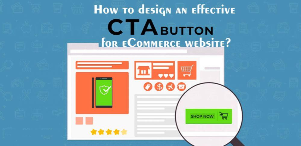
The CTA button works great but this can’t be the ultimate solution for every landing page.
Usually, users who want to buy the product click on the CTA button. And if you have a complex product description you can follow the AIDA concept for the CTA button.
AIDA features four things:
- Attention
- Interest
- Desire
- Action
It helps your users to learn the exact product description and they can complete the desired action such as purchasing the product or subscription to the list. In this way, they gain interest in your product. Thus, you can increase your sales easily.
For eg: Market experiments for a 20% increase in conversion rate after re-positioning the CTA button, which is done from the top of the page till the end.
Lesson learned: If you use a long-landing page, it’s not necessary to use the CTA button above the fold. Carry out A/B testing to find the optimal button placement option.
Collect Emails of Visitors Entering the First Time
Indeed, 95% of visitors never return once they leave your site.
Users usually won’t purchase their first visit. They at least visit 3-4 times before purchasing the product.
So, it’s important to record the emails of your first-time visitors. Using these email addresses you can send customized emails to them building up a good relationship.
You need to nurture the emails properly and thus you can send them updates in the future making them feel interested.
Now, it’s time to create different groups depending on geographic location, on-site behavior,r, etc that helps you to send personalized emails in the future. Next, you must compare the untargeted and personalized emails encouraging more conversion.
Lesson learned: Once you recognize the first-time visitors to your site don’t forget to collect their emails establishing a strong bonding.
Gain Trust Encouraging Purchase Decision
After all your attempts still there remains some challenges restricting your potential customers to make a purchase using your landing page.
Lack of trust is one of the big reasons bringing in the challenges Here are mentioned certain factors that help you to gain trust:
- Reveal the true information: Help them know that you won’t spam them and would never sell their emails.
- SSL certificate: You can now add an SSL certificate to ensure that your website is completely safe. You must make sure that you can use your credit card details and that it’s safe to use your landing page.
- Testimonials: You need to know how your customers feel about your products and services. It’s good to add the testimonials near the CTA button.
- Reassurance copy: The ‘click trigger’ inspires your visitors to click on the button. For eg: If you have an e-commerce site you can now easily build up trust adding encouraging them t purchase from your site.
Read ecommerce experts’ tips on “How to Create High Converting Landing Pages for Your Ecommerce Brand”
