
If you have a website of any kind, whether it is an ecommerce site or a company website, you must ensure that it is optimized for search engines so that your page ranks highly in the search engine results pages. In this day and age, you cannot afford to ignore mobile friendliness as you design and optimize your site. This is because more and more people are using their mobile devices to access the internet. In fact, the number of mobile internet users is now higher than the number of people who use desktops to access the internet. This comes as no surprise since people are becoming more reliant on their smartphones. They have their smartphones on them at all times and these are therefore the most commonly used devices to access the internet. Therefore, if you do not take steps to ensure that your site is optimized for mobile devices, you will be left behind by your competitors.
Your mobile site users are bound to get irritated by things such as font that is too small for them to comprehend, or too big so that they have to keep scrolling from side to side to see the full page. To avoid losing potential customers to your competitors due to such small things, you must ensure that your website is mobile friendly. There are many things you can do to make your site mobile friendly. These include:
- Increasing your page load speed
- Prioritizing visible content
- Having a simple and easy-to-use interface
- Making your pages lightweight so that they load faster
These are just a few of the things that you can do to make your site mobile friendly. One thing that Google advises websites to do to ensure mobile friendliness is to use the mobile viewport.
Here is what you need to know about the mobile viewport:
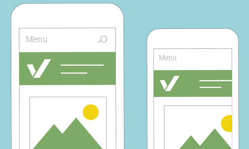
Many people have no idea what the mobile viewport is in the first place, and therefore we cannot go on without mentioning this. The window in which a webpage can be seen on a mobile device is what is known as the mobile viewport. It is important to note that the mobile viewport is not the area in which a page displays. This is because the viewport can be smaller than the dimensions of the page, which is a big problem as the user will have to keep scrolling from left to right to see the contents of the page. This happens when the viewport of a page is not configured, or when the viewport is missing altogether.
To add the viewport, one needs to use the viewport meta tag. One mistake people make is specifying the width of the viewport. As opposed to giving it an absolute figure, it is better to simply set it to the width of the device. This means that the viewport will automatically match the screen size of whatever device you are using. You will therefore be able to avoid the issue of users having to scroll from side to side to view the contents of the page.
Making the site responsive

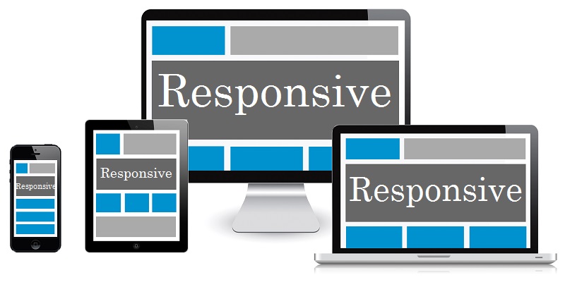
You need to do more than just setting the page’s viewport. The content on the page needs to be sized in such a way that it fits well in the viewport. This will ensure that your page renders correctly; in a way that is suitable for mobile devices. Below are a few guidelines you can use to ensure that your pages render well:
- As mentioned above, you should not rely on a certain width when setting the width of the viewport. The reason for this is that different devices have different screen sizes and specifying the width will bring you untold problems. The page will render correctly on the devices whose screens are the width you specified, but users of other devices will suffer. You need to ensure that your webpages render correctly regardless of the width of the device being used.
- Avoid having elements with fixed widths, for example, large images. When posting content on your webpages, adjust all elements in such a way that they fit within the viewport. Otherwise, you will end up with elements that are bigger than the viewport, which will cause the users to scroll from side to side in order to see the full image.
- When posting content, it is better to use relative width values as opposed to absolute width values. The reason for this is obvious; different devices have different screen sizes.
Improving your site’s SEO using the mobile viewport
To improve your site’s SEO and therefore make your page rank higher, you need to do much more than what is discussed above. Here is what is required for your pages to rank higher on the search engine result pages:
- Dynamic design – What this means is that you should have separate pages for mobile devices and for desktops. You will then serve the appropriate page depending on what device the user is using. You will need to instruct search engines on which page to serve to avoid confusion. This can be included in the HTTP header on each page so that search engines can tell the difference between the pages.
- Mobile subdomain – For this, you need to build a different site for mobile devices. You will then host this site at a subdomain. This way, Google will be able to tell the difference between your desktop site and your mobile site. However, it is good practice to indicate this on your site just to be sure. You do not want your desktop users to be directed to the mobile site, or your mobile users to be directed to the desktop site. This requires a huge investment in terms of time and resources and it might therefore be a good idea to hire SEO experts. If you have a digital marketing agency taking care of your digital marketing efforts, find out whether they provide white label SEO services. Your digital marketing service provider can connect you with people who can do the job to take care of your site’s SEO for you. There is no point attempting to do this on your own only to end up with mediocre sites that could cost you some of your potential customers. It could also cause problems for your site now that Google will be using mobile first indexing in the near future.


